
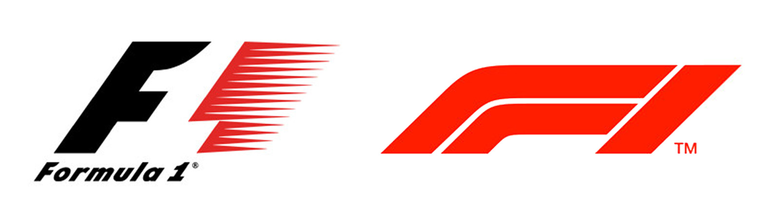
It’s a hot topic in the design world. We’ve experienced 23 years of the same, iconic Formula 1 (F1) logo, yet in the space of a night something new and modern has replaced what we were once familiar with. Advertising agency, Weiden+Kennedy have created a new identity that evokes the feeling of “speed, attack and control” as the logo embodies the form of a F1 car. But as they see it, leaning “into the future”, racing fans and drives alike haven’t been so forthcoming about the change.
Now from a personal perspective, I understand that this is a new era for F1 after the acquisition from Liberty Media in 2016. Changes have already been made to the sport with the establishment of dedicated FanZones, and new broadcast and digital deals have been signed, making it a ripe time to freshen up the F1 brand. However, I quickly fell into the camp of, why? Is this not change for change sake?
F1’s managing director of motorsport, Ross Brawn, believes that the old logo was “neither iconic or memorable” but that is where I believe he is wrong. I think the reason most people haven’t been keen about the change is due to a love of the former F1 logo and lack of understanding for the transformation, as there has been little communication up till now. Under the previous ownership of Bernie Ecclestone, the brand behind the F1 took a back seat. In his eyes, the public weren’t his customers as they didn’t fund the games and promote the races. His business model was based on exclusivity and cash, and not about sharing the F1 brand and involving the pubic in the brand experience. Which is perhaps why the identity hasn’t changed in the last two decades and why audience members now feel disconnected.
![]()
 Despite me initially questioning the new concept, the logo is beginning to grow on me in context. In an evolving digital world, brands need to be developing and growing their identities to align with new audiences and become a flexible asset for both online and offline applications. However, since there has been an insight communicated as to why Liberty Media followed the road they did with the new branding, it turns out unfortunately, like the driver introductions at the Austin GP, the art of subtlety is completely lost on the new US owners!
What makes the former logo so iconic is the use of negative space to create the ‘1’ element of the logo, but F1 Chairman, Chase Carey, has stated that this use of ‘negative space’ to create the ‘one’ had been the one reason for the change; this just makes another little bit of me die. I fully appreciate the time and effort that goes in to creating a new logo, but time and time again the artistry of crafting something as clever as logos, which incorporate elements such as the old F1 logo, is lost on unimaginative people who tend to opt for something that can be created on a $99 logo site!
I’m not saying that moving forward, this new concept won’t work, as F1 aren’t the first global brand to make such a drastic change to their branding. When the social media platform, Instagram, revamped their identity last year, it was met with a similar response, but look at the brand now. The old logo just becomes part of their history and heritage. So as we enter a new era for F1, it will be interesting to see how Liberty Media take the brand forward.