
The story starts in 1965 when Pete’s Super Submarines was set up in the USA by a 17 year old student. He had two reasons behind his ambitious summer project- a) he was looking for a quick way to make money to pay his tuition fees and b) he enjoyed tucking into a burger or two at a family BBQ. Little did he know it would turn into a multi-billion pound business, feeding the nation’s hunger with salads, sandwiches and not forgetting those all-important cookies.
They currently have over 8000 more branches than McDonalds, who would have guessed it, so we must all be going crazy for the freshly baked subs. If you’re not then you must be when you’re met with the mouth-watering smell of the restaurant before even passing it. But with the inviting smell, comes the “picnic” style seating, sandwich production line and the usual “Would you like it cheese toasted?” Does this make you question the quality and care given when creating your very tasty sandwich? 10 out of 10 for customer experience.*
Maybe the new Subway brand due to be rolled out in 2017 will improve this fast food chains customer’s expectations. So what do you think?
The current logo (left) is slab italic. All confined within a single green stroke with large clumsy arrows, trying to give an illusion of balance on either end of the logo. But it is all we know and we like it. Yellow is physiologically the happiest colour in the colour spectrum, showing optimism and clarity. The article “Impact of colour on marketing” found that 90% of snap judgements made about products can be based on colour alone. Additional studies have revealed our brains prefer immediately recognisable brands, which makes colour an important element when creating a brand identity.
So why change?
- Outdated brand – The evolution of the Subway logo has regressed too much over the years, so now it is starting to look dated.
- Market changes – Creating a more web friendly look will help the brand move forward with technology. As your target market changes when users start to use different platforms and technology, the brand needs to do the same. We don’t want it getting lost after all these years sitting as a strong competitor in the fast food market.
- Simplifying for better recognition – Customers probably, maybe, automatically still remember the logo relating it back to the Subway original. Subway haven’t gone crazy. Just modern.

The National Opinion
Their new logo is receiving mixed reviews, Subway have a prominent brand that is everywhere. You think of a sandwich take out, you automatically think Subway right? We don’t like change, but actually it isn’t too far from the 70s logo! And this is really exaggerated within their brand refresh. It’s like stepping back in time and stripping out all the “fancy” bits. Their new symbol even sneakily hides the “S” for Subway between two very large branded arrows. This is now becoming a recognisable symbol, keeping up to date with market changes., it also will work great for their app and Social Media {refer back to point 3}.
Our Brand King’s Opinion
“The first look. Side by side. I’m SubYAY. The rebrand has been a sympathetic refresh making the logo clean and modern looking, inspired by the original logo back in 1969 (without the dodgy, upside-down, similar-to-McDonalds, golden arches). However, there’s always a however. As much as I’m enjoying the new iconic graphic with its sneaky hidden ’S’ in the arrows, I do feel it has a slight logistics company feel to it. The more I look at the more it’s not quite hitting the mark, but as a true designer I’ll stay open minded and wait patiently to see how it looks when it’s officially launched and rolled out online and instore.
One Other Interpretation
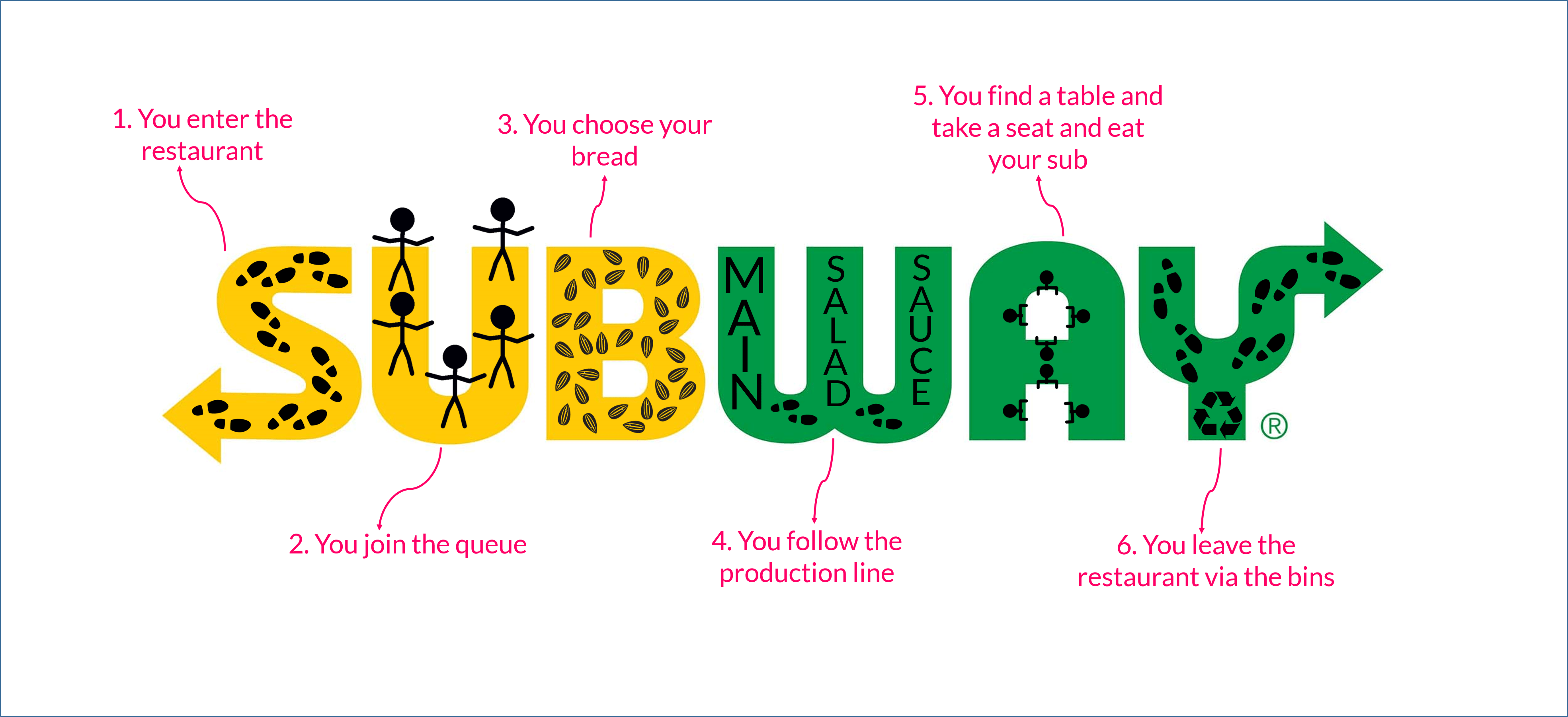
With all the chatter round the office there’s also been one other opinion on what the new subway logo means, but rather than try and explain we’ll leave you with a little image they’ve created.
So the new logo will soon bed its way in, at the moment it’s like a new pair of shoes, needs to be worn and used for a while before you finally accept them!
*If you’re not accustomed to our sarcasm then you may be in belief that we think Subway offers a 10/10 customer service. Some members of the team believe this, but others are little more hesitant.